Minimalist Tips for Natural Light Photography
Everyone knows that one of the best parts of getting a new sectional or modern coffee table is showing that baby off. You can imagine the likes and comments that will roll in after you post your carefully styled, clutter-free new space. But something’s wrong. The bright and minimalist, magazine-worthy image you visualized instead looks like it was taken from a flip phone in the darkest corners of a nightclub. If this has happened to you, you’re suffering from a dearth of natural light. To help you get the absolute best photos of your space, we spoke with editorial and lifestyle photographer Gillian Stevens to create this minimalist’s guide to leveraging natural light.
Gillian’s understated, less-is-more approach to photography and styling has been featured in countless interior design publications, and she’s even brought her expertise to a popular online If I Made class. Continue reading to learn her tips and tricks for nailing that perfect minimalist photo so you can show off your space—and your undeniably refined taste.

Hi Gillian! Thanks for chatting with us. Can you tell us a bit about what you do?
I’m an editorial lifestyle photographer based in Vancouver, BC. I work with brands and businesses, creating content for digital portfolios, marketing campaigns, online and social media outlets, as well as for print and digital publications.
In addition to photography, I also lead styling and creative direction for photoshoots and websites, and love putting visual stories together for photoshoots right from idea conception to the final production stage.
I specialize in working with fashion, home and lifestyle brands, as well as travel, food and hospitality, real estate companies, artists, and entrepreneurs.
How do you incorporate minimalist principals into your photography and styling work?
I am very drawn to a minimalist aesthetic. Even in my personal life, I feel the most calm in a space that has a lot of open space and isn’t cluttered. I think especially in a small space with limited storage options, keeping things minimal can help with not holding onto too many “things” that don’t have use.
Visually, I love minimally decorated spaces filled with neutral colours. I am drawn to them, most likely because of how I feel when in them. I wouldn’t say I am an extreme minimalist though. I love collecting beautiful things such as ceramics, soft textiles, well-made kids toys, greenery and florals, etc. I think all of these things look best against a neutral and minimal backdrop, so it all works together in harmony.

Many of our readers and customers live in spaces that might not have a lot of windows or natural light sources. What can a beginner photographer do if they are shooting in a space with low light?
Painting your apartment white or another light colour can really help if there isn’t a ton of natural light. Even with artificial or darker lighting, white walls can still help produce really nice pictures. And work with whatever natural light you do have. Taking photographs beside a window will always give off the best light and result in the most beautiful pictures.
Mirrors, like the Beau, can also help reflect natural light and make your space appear bigger and brighter. Just make sure your reflection isn’t visible in the mirror when taking the photo!
Now at the other end of the spectrum, are there ways to control lighting when there’s just too much of it? What can photographers do when a space is too bright and over-exposed?
I don’t think there is a such thing as too much natural light in a space! But when trying to get even lighting on an image in a very bright space, hanging thin, white linen curtains over the windows will diffuse the light beautifully. I’d still suggest shooting close to the window, but this helps remove any direct rays coming in that might create harsh light in photos.

Do you find that certain lighting works better for certain design styles?
Light can definitely play in interior design. I actually think that harsh contrasted light or even artificial light can really suit that mid-century modern style that is so popular right now. It’s fun as a photographer to use light to manipulate the mood of a photo depending on the desired design aesthetic.
For example, a mid-century sofa like the Sven in a Grass Green velvet looks great in a high-contrast or artificial light situation. This type of lighting really brings out the color and texture of such a dramatic and beautiful piece.
When shooting a piece like the Denman lounge chair in the Canyon leather, a softer and diffused natural light works really well. When paired with this kind of light, the neutral palette and minimalist style can come together in a stunning way.

What are your best tips for making the most of natural light when you’re using a smartphone camera?
If you’re inside, shoot as close to a window as possible. I find that a great spot is against a wall, right beside a window.
For outside, shooting in the morning and evening when the sun is highest and lowest will always produce the most beautiful images. It’s called the golden hour for a reason! Pro tip: do a quick search of your smartphone’s app store to find tons of apps specifically designed to notify you when it’s the golden hour in your timezone.
When it comes to editing my photos, I like the VSCO cam app for it’s minimalist aesthetic and high-caliber tools and features.

Imagine you’re shooting a living room spread. How would you position the furniture and the shot in relation to the lighting?
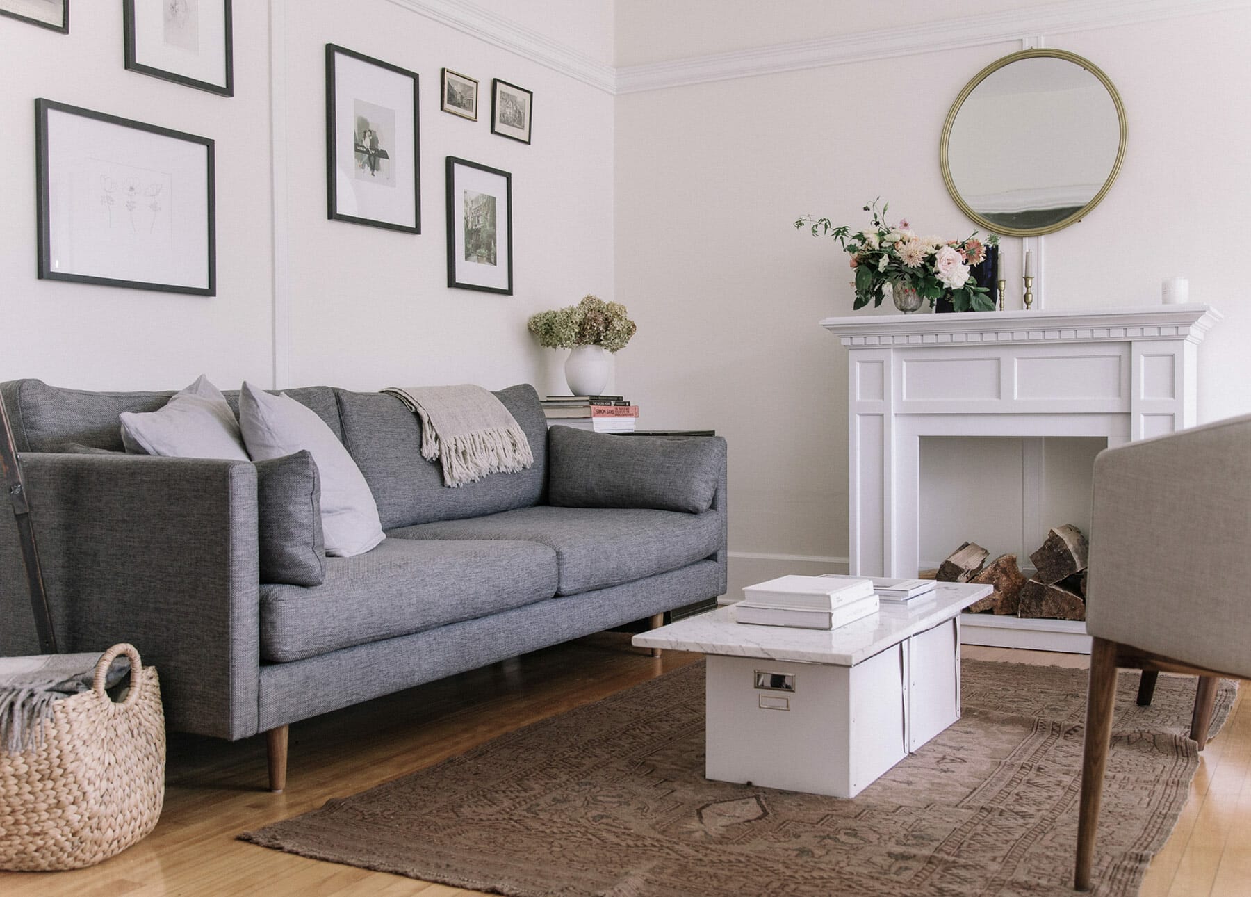
I always shoot all angles for a living room spread, like the one featuring the Anton sofa below, but typically I always shoot the walls next to a window. I also like shooting the overall room both straight on as well as on an angle.
What weather makes for the best natural lighting? What time of day is best, from a photography lighting perspective?
If shooting outside then morning or evening light (on a sunny day), and if you’re shooting inside then it’s more flexible but bright days are still best.
Play around with your camera (whether a DSLR or smartphone) at different times of the day and see which lighting works best for you and your style. Minimalist, Scandinavian living room furniture might look amazing at the brightest part of the day, while a wood-panelled home office or library looks best photographed with moody, darker light.

Why is natural light so important when it comes to shooting beautiful photos?
Natural light brings out the truest and richest colours in an image. Understanding the way the light moves and changes throughout the day was what made me initially fall in love with photography.
I was obsessed with learning how to capture light in the way my eye saw it, and spent many hours with my first DSLR camera learning everything that I could.
What’s the biggest challenge photographers face when it comes to leveraging natural light for photos?
In my work, the biggest challenge is making timing and schedules work with the best natural light. Lighting is never the same. A rainy day will produce very different light than a sunny day, as will winter versus summer light.
When working on strict schedules, I do the best I can to work with whatever light I’m given. This is especially important if there is no wiggle room to move a shoot day due to weather or time, but it can be challenging when a client is looking for bright images on a dark day—or if the space I am shooting doesn’t have amazing natural light options.
As you know, lighting can make or break a photo. Whether you have a bright space with tons of windows, or a darker, cozy spot that’s all your own, you can get beautiful photographs thanks to Gillian’s tips—no expensive equipment required.

