Fresh Modern Decor Tips
Here at Article, we’ve been working hard to distill global trends and figure out what we wanted our home decor for the new year to bring to our customers. 2018 felt like a long, wild year. It paired dramatic wall colors with soothing sage, brought back terrazzo tiling, celebrated natural materials like never before, and the emerging of smooth, sixties-like curving lines. One thing we really want for the next year: a slowing down. A chilling out, maybe. So we focused on building out a design catalogue that would support beautiful, relaxed spaces. Pieces that emphasized how it feels to sit with your friends and family. That make a statement, but don’t bring a lots of extra drama. That feel playful but refined.
With those tenets in mind, we’re excited to bring you our focus this year: Fresh Modern. Broken into three approaches, this design emphasizes a paring back. Abundantly thoughtful, but minimal too.
Simple Living in Modern Times
One thing that felt both necessary and obvious was the decision to cut back. To make room for and respect simplicity. As such, we looked at products with super crisp lines in fresh, earthy neutrals. Our Solae sofa series is the undisputed star here: French seams, supple leather or fabric options, low profile, and incredible plush — this is the kind of down-to-earth majesty we’re going for.

A seriously dreamy, seriously simple space. Our Solae sofa looks great paired with the Brezza coffee table, Texa rug, and Heron lamp.
To learn into your own interpretation of Simple Living, start by purging your space of unnecessary bits and bobs. Creating space doesn’t mean you have to sell everything you own and buy a brand new sofa — it can be as simple as finally donating that guitar you don’t play, or switching up your art. Once you’ve successfully decluttered your space, look at your color scheme. Simple living isn’t just about minimalism: it also asks that you lessen visual dissonance. Streamlining the colors in your space goes a long way towards making it feel more calm — especially if you focus on soothing neutrals, like tan, white, or cool grey. While a coat of paint is a great way to refresh your rooms (symbolically and in the real), you don’t have to break out the paint brush. It’s as simple as switching to some modern throw pillows for a tighter palette, or updating an armchair to a chill color.

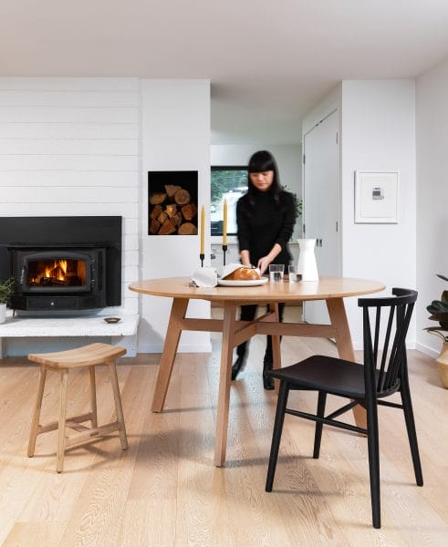
Our Ventu table is a beautiful place to eat breakfast. Pull up your Rus chair or your Esse stool. Hard to pick where to sit.
If Simple Living is your design resolution, think of it in terms of “fewer things, higher quality.”
Balance at Every Level
Balance is always something worth striving for. And while we’re definitely excited about simplicity, we don’t want “simple” to mean “bare” or “flat.” Our design tenet of Balance is about creating rooms that are pared back, but still have a sparkling personality. To achieve this, we focused on products that allow us to layer in textures, shades, and function without drawing attention away from the simplicity of a space. The leather-topped Esse stools, for example, mix together smooth, simple construction and stately textiles. The alpaca wool Mollo throws looks gorgeous casually tossed over a sofa (maybe the Abisko), just like the Belez pillows. A modern pouf, the Texa with its neutral color scheme and fun nubby texture, is a great example of how balance brings function and levity to a modern living space.

We love the simple styling of this built in shelf providing a backdrop to our Ventu table and Kissa chairs. Special cameo by the Texa rug.
To practice balanced design, take stock of your space. Are you seeing a lot of utilitarian pieces, but not enough fun accents? Or maybe you’re looking at a room that is covered in blankets, pillows, and fun textures, but lacks grounding. To achieve balance in your space, focus on building a neutral base and layering color and texture on top. The neutral base allows you to experiment as trends and your personal style changes. To avoid going into chintz-town, keep an eye on your accents. A fast way to overthrow the balance of your space is to layer rugs AND throw pillows AND cozy blankets AND knickknacks. Instead, choose a few that you love and the evoke the feeling you want in a space, and rotate in to compliment how you feel as the year progresses.

We love the high/low of the Culla dresser (great for storage) and the Esse stool (great for artful display of purses).
If Simple Living is your design resolution, think if it like “everything in moderation — except for moderation.”
Space to Play
It might sound like we have gone full-blown art gallery contemporary. “Keep it simple,” “Zen-like balance,” “neutrals = king.” While we stand behind all those assertions, we also know that a home is not a museum, and it shouldn’t look like one. In addition to all the upscale basics, we’re encouraging playful injections of color. What’s the saying? Man can’t live on simple neutrals alone. We’ve expanded some of our classic lines (like the ever-popular Svelti) with saturated pastels, and brought in some design heavy-hitters (hello Silicus coffee table line) that feature creamy, glassy hues.

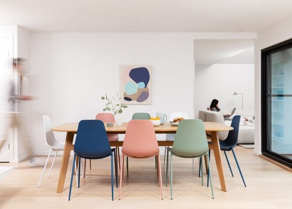
This sweet collection of colorful Sveltis around the Ventu table makes this space playful and inviting without being overly busy.
While figuring out how to inject color into our chill, nature-forward spaces, we focused on making them feel lighthearted. A grounded space, thin black accents, cushy grey sofa — pink coffee table. A contemporary dining table surrounded with cheerful Sveltis. The key to incorporating playful accents is to commit to a few key pieces that really sing. Go bold! But don’t go crazy. A lilac reading chair and a pink coffee table work together because they belong to a similar color family. Whereas if the chair was lilac but the coffee table was a hot orange, the room would look off kilter and out of balance.

We love the Solae sofa (in fabric!) paired with the Happy chair in that peaceful lilac color. The Silicus coffee table looks right at home topped with some cheerful greenery.
If Space to Play is your design resolution, it might be helpful to frame it like “neutral hard, color hard — equality for all.”

